Themes
A theme is a specialized Preference pack that ships a Qt stylesheet and (typically) a matching set of preference values, overlay icons, and a stylesheet for FreeCAD’s overlay panels. Applying a theme switches FreeCAD’s entire visual appearance with a single click. Mechanically, a theme is a <preferencepack> content item in package.xml with and added <type>Theme</type> XML tag. This <type> element is what makes the pack appear in FreeCAD’s theme selector (rather than only in the plain Preference-pack list).
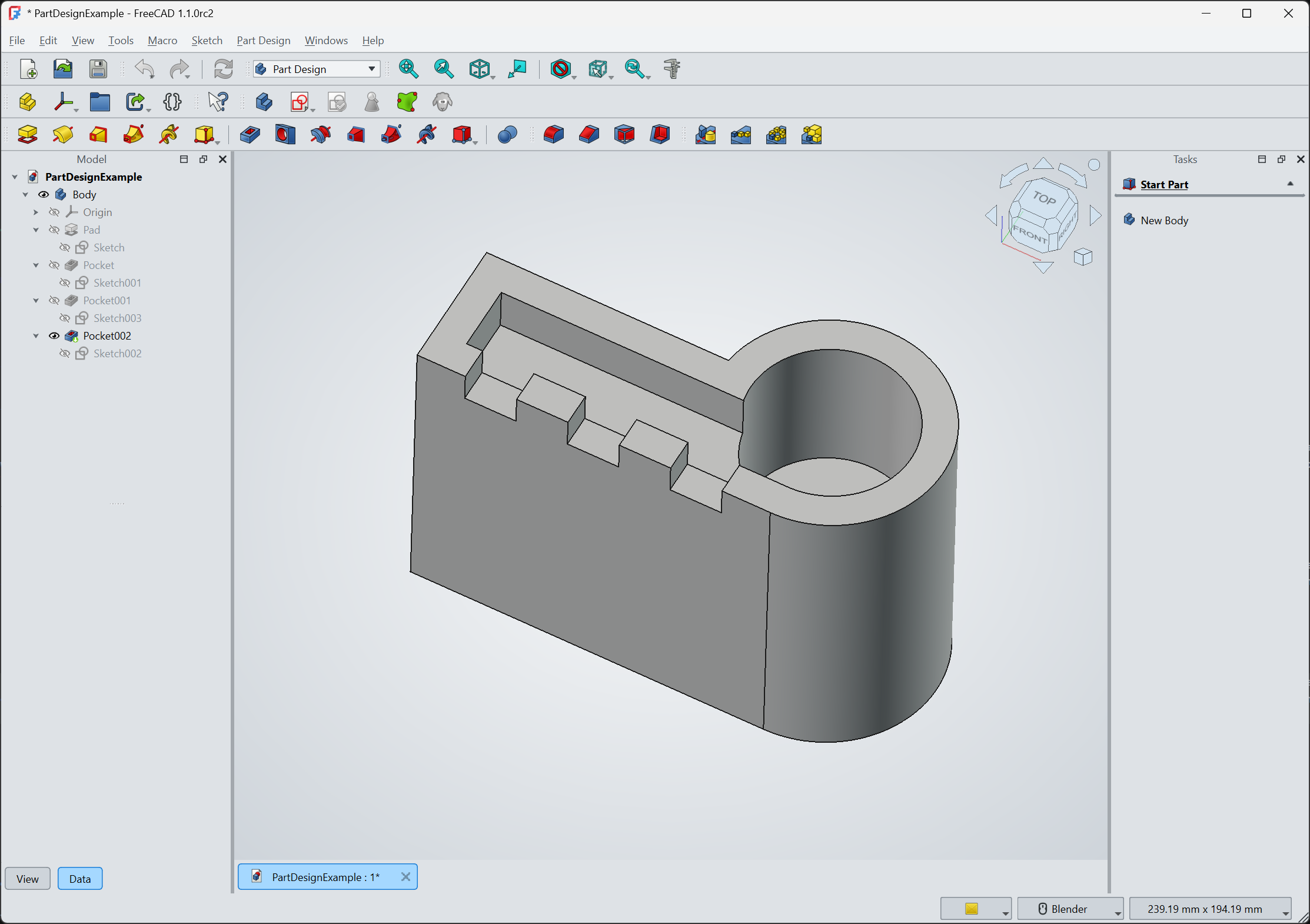
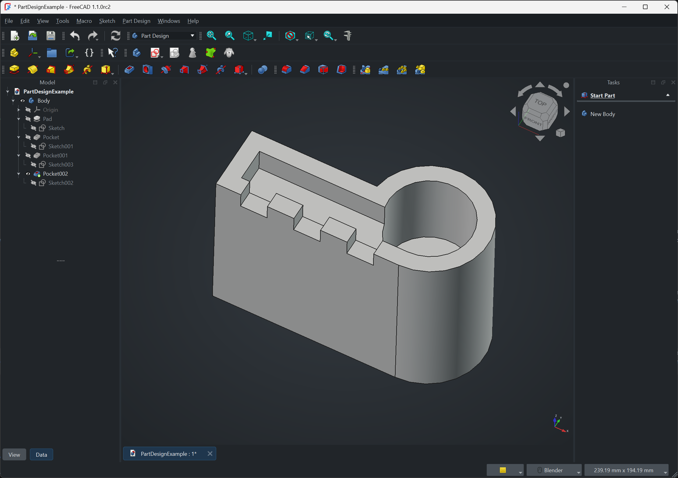
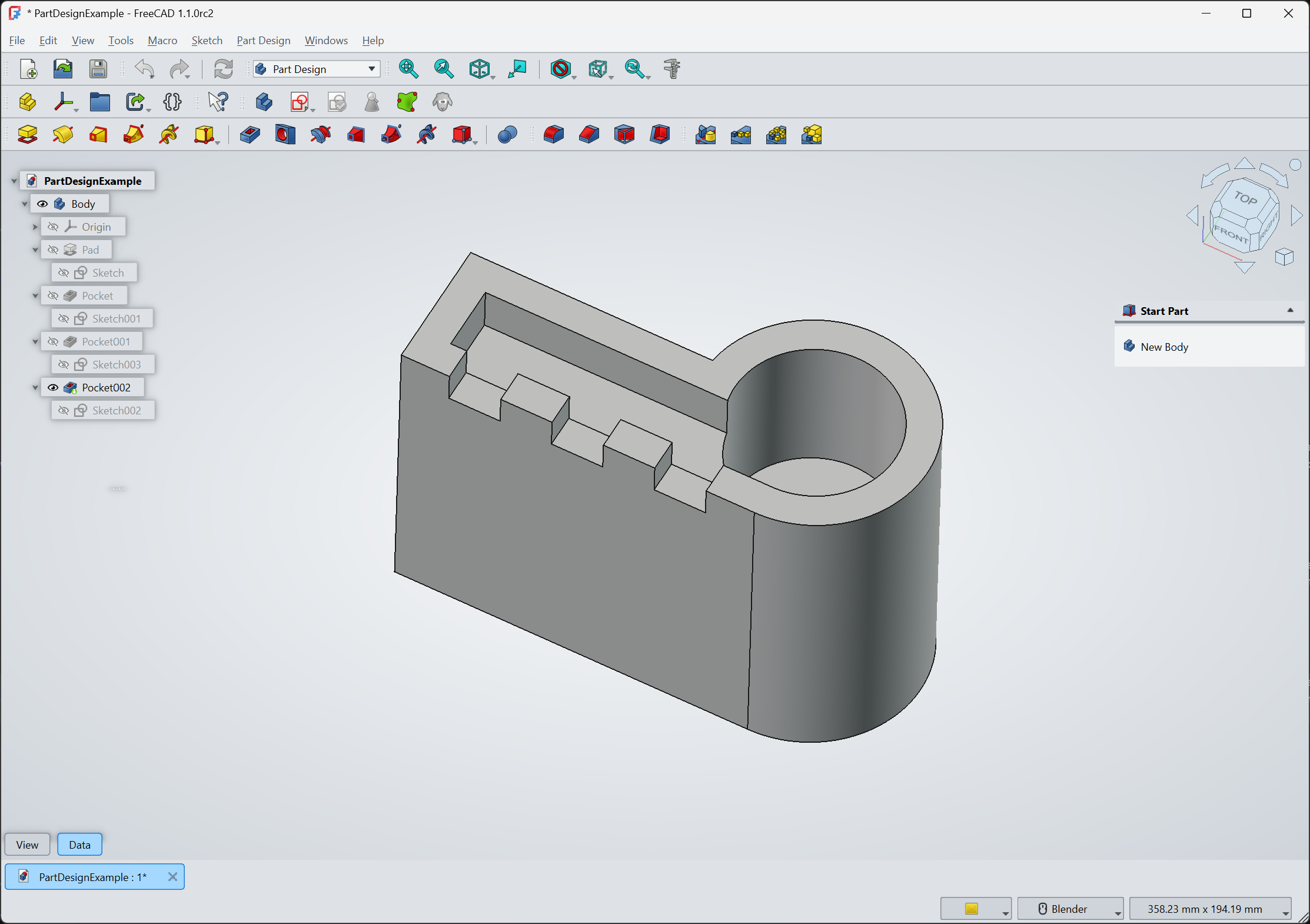
The same Part Design example with two different themes from the OpenTheme addon applied:
Anatomy of a theme
A complete theme typically ships:
- A Qt stylesheet (
.qss) defining the look of FreeCAD’s widgets: backgrounds, button states, scrollbars, dock-panel chrome. - An overlay stylesheet (
*-overlay.qss) for FreeCAD’s translucent overlay panels (the floating Tasks, Tree, and Properties views). Without one, the overlays default to FreeCAD’s built-in overlay style and can clash with the rest of the theme. - A preference values file (
.cfg) carrying the matching color and font defaults that the stylesheet alone cannot set: 3D-view background, Sketcher edge colors, document-tree font sizes, and similar parameters. The.cfgis anFCParametersXML export of the relevant subtree ofUser parameter:BaseApp/Preferences/. - Optional overlay icons (
.svg) for the close, float, mode, and transparency controls on overlay panels, when the default icons do not read well against the theme’s background.
Some themes also ship a YAML overlay-config or a companion plain preference pack that bundles “recommended settings” (font sizes, autoload modules, default workbench) without claiming to be a theme.
Directory layout
A multi-theme addon typically organizes each theme into its own subdirectory:
MyThemes/
├─ package.xml
├─ README.md
├─ LICENSE
├─ Behave-dark/
│  ├─ Behave-dark.qss
│  ├─ Behave-dark.cfg
│  └─ overlay/
│     ├─ Behave-dark-overlay.qss
│     └─ behave-dark-icons/
│        └─ ...svg
└─ Light-modern/
   ├─ Light-modern.qss
   ├─ Light-modern.cfg
   └─ overlay/
      └─ Light-modern-overlay.qss
A single-theme addon can flatten this if it only ever ships one theme.
The package.xml declaration
Each theme is a <preferencepack> content item with <type>Theme</type> and one or more <file> references:
<content>
    <preferencepack>
        <name>Behave-dark</name>
        <type>Theme</type>
        <tag>dark</tag>
        <file>Behave-dark.qss</file>
        <file>Behave-dark-overlay.qss</file>
    </preferencepack>
</content>
If the theme files live in a subdirectory of the addon root, declare it with <subdirectory>:
<preferencepack>
    <name>OpenDark</name>
    <type>Theme</type>
    <tag>dark</tag>
    <subdirectory>./OpenDark/</subdirectory>
    <file>OpenDark.qss</file>
</preferencepack>
<file> paths are resolved relative to the declared <subdirectory> if one is present, and relative to the addon root otherwise.
Qt stylesheet (.qss)
The main .qss is a Qt stylesheet using standard Qt selectors against FreeCAD’s widget tree. The bulk of theming work happens here: panel backgrounds, button and toolbar styling, tab and splitter chrome, scrollbar appearance, and tree- and table-view rules. FreeCAD’s Qt widget tree exposes both standard Qt classes (QPushButton, QToolBar, QDockWidget) and FreeCAD-specific classes that themes can target. The most reliable way to discover selectors is to start from an existing theme’s .qss and adjust; the FreeCAD-themes repo is a good reference.
Overlay stylesheet
FreeCAD’s overlay panels are translucent floating versions of the standard docked panels (Tree, Properties, Tasks). They use a separate stylesheet so the translucent-background mode can be styled independently of the regular panels. The overlay stylesheet conventionally lives in an overlay/ subdirectory next to the main stylesheet, named <ThemeName>-overlay.qss. If the overlay icons (close, float, mode, transparency) need to match the theme, ship custom SVGs in the same overlay/ subdirectory and reference them from the overlay .qss via image: url(...) rules.
Preference values (.cfg)
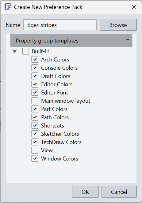
The companion .cfg is a slice of FreeCAD’s preference store, in the same XML format that User parameter:BaseApp exports to. The simplest way to produce one is to set the colors and defaults in FreeCAD interactively, then use the Preference Pack export feature to dump the relevant subtree. Trim the export to only the keys you intend the theme to set; including unrelated keys means the theme will overwrite a user’s unrelated settings on apply.
A typical theme .cfg covers entries under:
BaseApp/Preferences/View: 3D view background, navigation cube colors, default light.BaseApp/Preferences/Mod/Sketcher: sketch edge, vertex, and constraint colors.BaseApp/Preferences/Mod/Draft,BaseApp/Preferences/Mod/Arch, etc.: workbench-specific colors.BaseApp/Preferences/General: toolbar icon size, default Qt style.
Shipping multiple themes in one addon
The convention is to put each theme in its own subdirectory and declare each as a separate <preferencepack> in package.xml. The user sees each one as a separate entry in the theme picker:
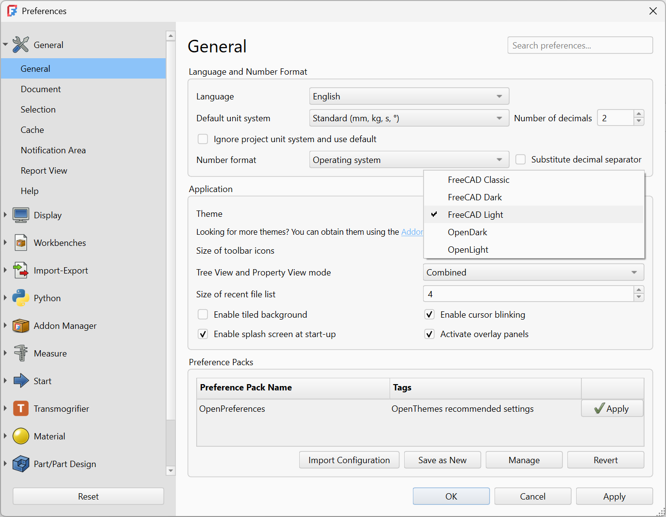
Current addons show two different patterns:
FreeCAD-themesships seven themes (Behave-dark, Dark-contrast, Darker, ProDark, Dark-modern, Light-modern, Behave-dark_1_1_Plus) from a single repo, one subdirectory per theme.OpenThemeships two<type>Theme</type>packs (OpenDark, OpenLight) plus a third plain preference pack (OpenPreferences) of recommended companion settings without<type>Theme</type>. This pattern lets a user adopt the look without the opinionated settings, or vice versa.
Tagging and discovery
Two tag conventions for theme addons:
darkorlighton each<preferencepack>so users can filter by visual style in the theme picker.theme,stylesheet, orbuilt-inon the addon-wide tags in<package>for searchability in the Addon Manager.
The <type>Theme</type> element is the one that determines whether the pack appears in the theme picker. Tags are used to help a user search for your addon, but don’t affect functionality.
Related
- Types of addon: the full list of addon types.
- Manifest: the
package.xmlschema, including all<type>values. - Metadata & discoverability: the
theme,stylesheet,dark,lighttag conventions.